How to Make Sense of Reduction Linocut
The first time I carved a reduction linocut was a revelation.
It was also the first time I printed a linocut from a Vandercook letterpress, so the revelations multiplied over one another to create a printmaking experience that has shaped my artistic practice ever since. Yeah. I love it.
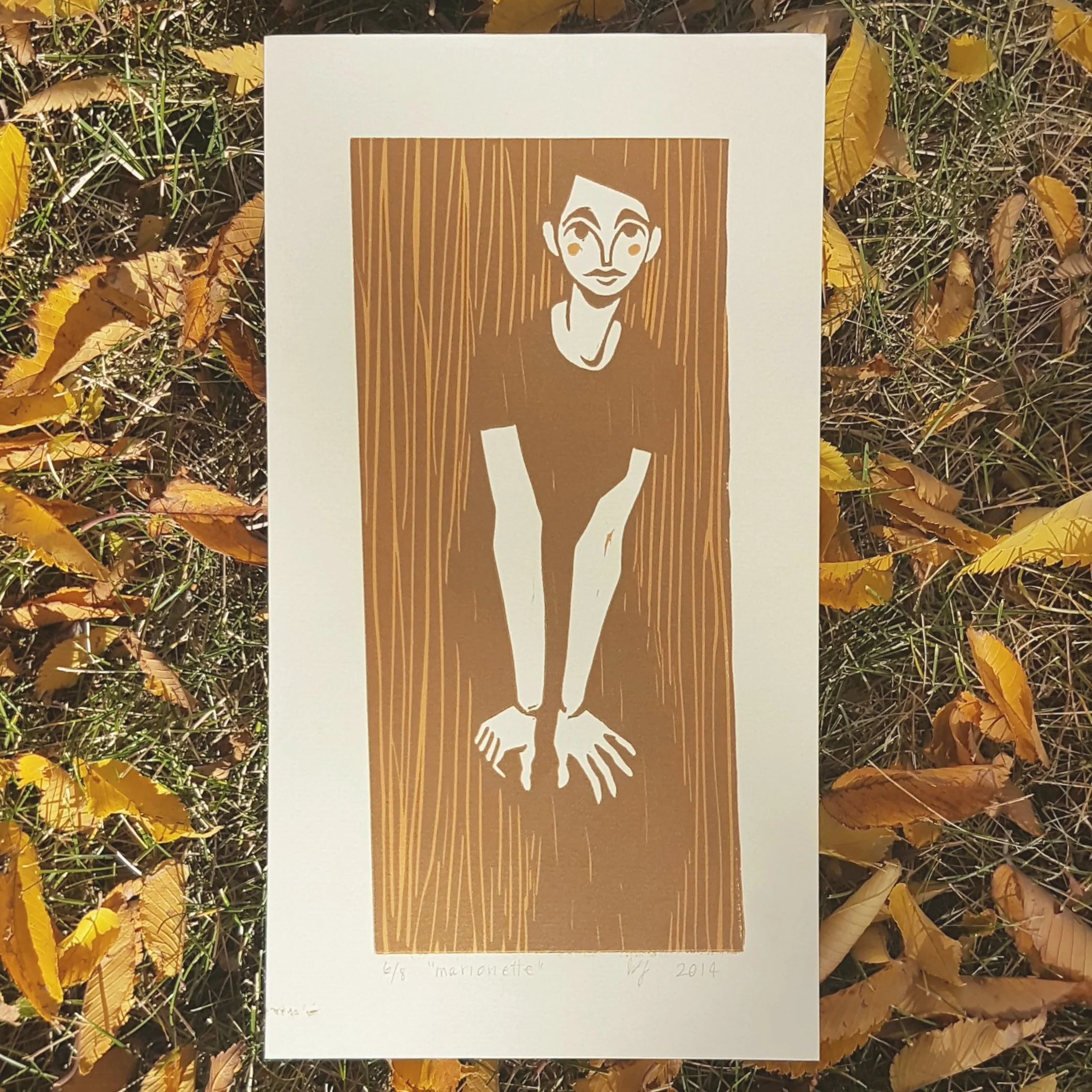
Marionette 4x9” 2016
What is Reduction Linocut? (what other kinds of linocut are there?)
Reduction linocut is a technique for achieving multiple colours in a single print while only using one block. You carve one layer, print it across your edition, carve some more, print again on the same pages, and repeat as needed.
There are a few kinds of linocut. We have:
Single layer linocut - You carve, you print, you're done. You get two colours: paper and ink.
Reduction linocut - You carve, you print, you carve, you print... you're done. You get as many colours as you want, but as a general rule, your consecutive ink colours must be darker or less saturated than the previous layer.
Multi-block linocut - You carve more than one block to line up with each other during printing. You can print them in any order. You get a truly unlimited number of colours, but good luck keeping them straight! (Check out How to Draw for Linocut Printmaking, where I explain that with 10 separate blocks, you can achieve more than a thousand colours!)
Selective Inking - You apply ink with brayers to specific areas of your block(s). This can be meticulously and repetitively done to achieve an edition of multiples or done intuitively/experimentally for a series of monoprints. (See the work of Laura Boswell and Anya Barabanova)
Puzzle Block Printing - A version of selective inking where the areas of your block that receive different inks are cut out from one another, inked separately, and pieced back together before printing. (See the work of Lili Arnold)


One more disclaimer: while reduction linocuts are truly the best, please start with at least one single-layer print before you dive in head first. Okay? Okay.
Why Reduction Linocut is Totally Awesome:
You achieve at least 3 colours (2 inks plus paper), and you only have to register the layers during printing, not during drawing and carving since it's all on one block.
It's FAST. I often turn out a reduction linocut in 2-10 studio days, depending on the edition and block size. (This has a lot to do with using a self-inking letterpress.) You also save time by only having to clear areas once as compared to a multi-block linocut. (This also saves your wrists and elbows)
You get an automatically cohesive colour palette.
You consume less material than multi-block printmaking for a similar finished look.
Did I mention registration?
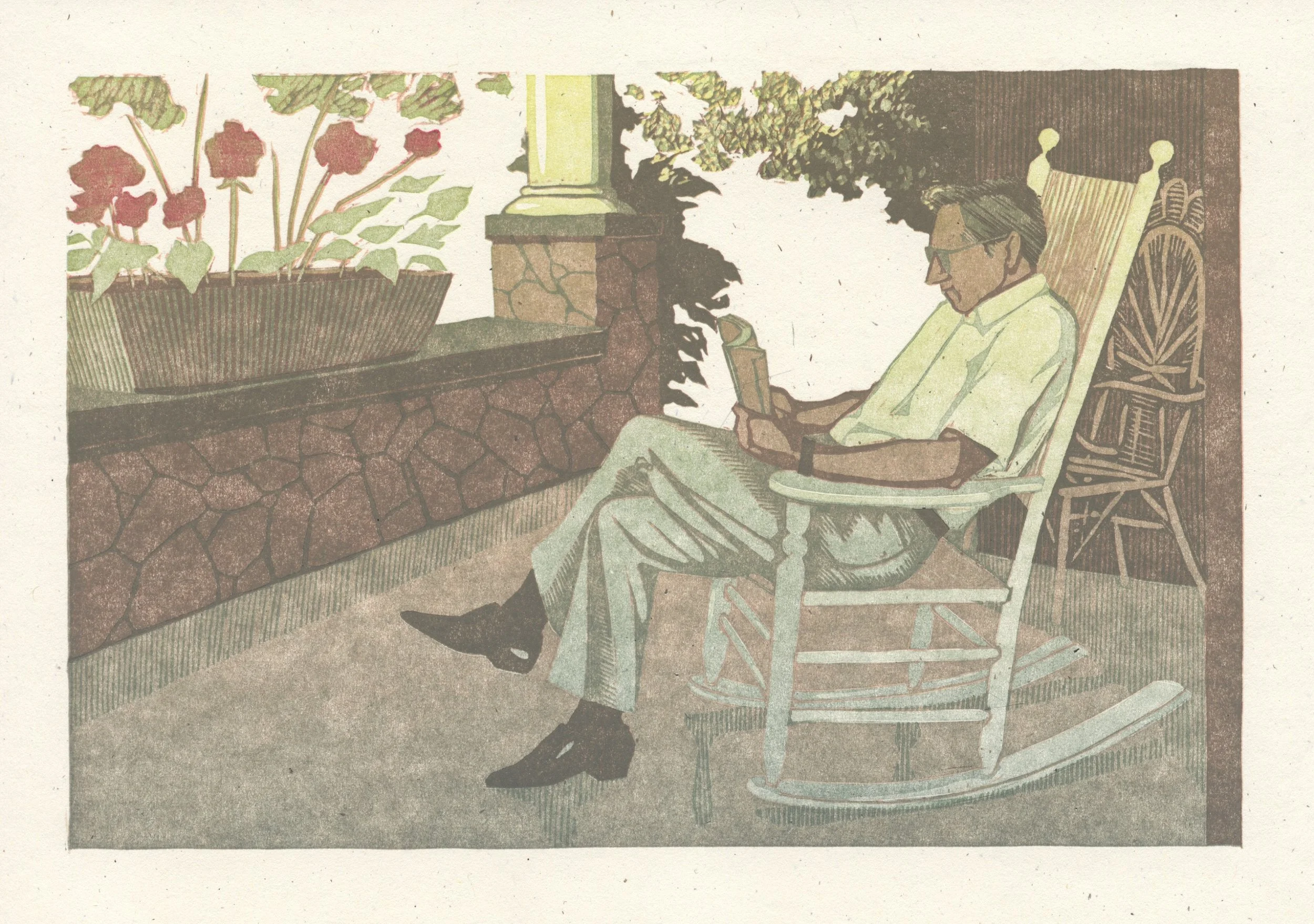
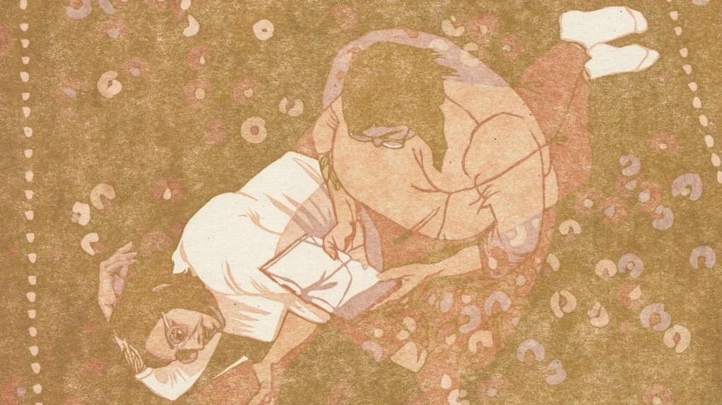
A Case Study: Unconscious Movement

While working on this print featuring my friend Sanaa, I scanned after each layer specifically so I could show you how this goes. I wanted to capture the feeling of one of those sunny winter days where you're free to read for hours, and time is measured by changing your position around the book. I'll be taking you through it layer by layer to explain what I was thinking and planning, how things went, how I trouble-shooted (trouble-shot?), and how I achieved the colour of each zone of the print.
I always start with a line drawing and a rough idea of a colour palette. Sometimes I put little hatching marks to indicate a middle tone, see under the chin of the figure lying down?


A note on the colour palette: The first three layers are to establish a skin tone. I go into detail about my colour strategy in How to Draw for Linocut Printmaking, essentially, it's about how local colour isn't that important. This is where I break my own rules. I think that for a print based in realism, as this one is, then skin tone is important to render in a life-like palette. After those first three colours, my options open way up. I often improvise slightly during that phase of the linocut according to what looks good on the paper (as opposed to inside my head or on a screen). I adhered pretty closely to the plan, although simultaneous contrast makes certain colours difficult to discern. More on this below.
To preserve your drawing on the block through multiple layers you have a couple of options. The one you pick will mostly depend on the kind of lino you’re using.
For Unconscious Movement, I was working with battleship linoleum (classic art store lino, with the burlap on the back) and I used Sharpie (has to be brand name) to draw on the block. On the battleship linoleum I make my drawing in Sharpie, leave it at least a day (you can be carving during that time), then clean it off with a solvent. I've used both mineral spirits and blanket wash. The residue that transfers when you print comes off, AND (here's the magic) your lines stay faintly in place from the staining properties of this marker. Those faded lines will stay on your block through a decent amount of carving and printing. Keep an eye on them as you make your way through this process and reinforce them as needed.
Since 2020, I’ve been mostly using a vinyl-like marmolleum instead of classic lino. It’s cheap from my local end-of-the-roll flooring store, and it carves without crumbling. Since it lacks the porosity of battleship lino, I have been preserving my drawing between layers by inscribing the lines VERY faintly when I'm carving the first layer. I use my smallest v-gauge and press only hard enough to scratch the surface. The lines are so faint that they mostly don't show up during printing, but (especially when stained with ink) they do show up on the block, giving me just enough of a guide to know what I'm doing.
Layer 1
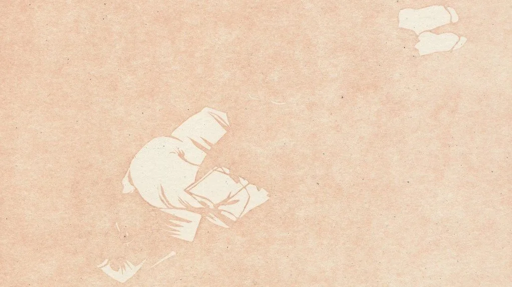
Okay, first off, I love how you can see every little thing in these scans, and depnding on how you're reading this (laptop, phone, tablet) they might be close to actual size: 8 x 8". The face you can see most clearly is about the size of my thumb.
In the first layer I tried to establish the difference between the lightest area of skintone and bright white. The two figures are overlapping, and I decided sort of arbitrarily that the figure lying down would be opaque and the sitting figure would be translucent but in front. So the shirt and socks that are white on the lying down figure, are muted lights in the sitting figure and don’t make it into the first carve. The book held by the sitting character is also translucent so it's only white where it overlaps with the white shirt behind it.
In hindsight, this is a fairly complex case study, but that’s the only kind of printmaking I do. In 2023, I was doing even more complicated prints, and I started making a list in my sketchbook and crossing off all the image areas for each colour layer. I have a planned colour palette labelled numerically, and (for example)
Layer 1: light sources, glass reflections, stars;
Layer 2: skin highlights, wallpaper flowers, shoes of character C
Layer 3: middle skintones, shirt of character A, books, table lamp lowlights,
etc
Otherwise, it’s easy to forget to carve something, and there’s no going back.
Layer 2
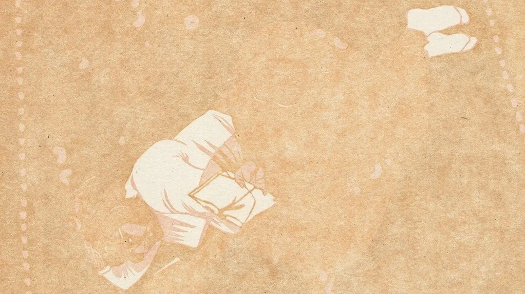
In the second layer, the colour is again determined by Sanaa's skin and the slightly warmer tone of her forehead compared to the paler pink of her cheek. I agonized over that line of separation. It looked so stark when this was all that was on the page. I had to keep reminding myself that my eyes were playing tricks and that the contrast I saw at this point was not representative of the final image.
I decided to render the carpet slightly skewed at this point (a spontaneous choice) and sharpied over a whole other design that I had planned but was looking too busy. You can see the effect that this has on the print by finding the subtle edge of the figures. They're slightly lighter and more saturated compared to the barely darker, grayer background.
I brought in a few details here on the hands and carved the tattoo on the lying down figure. I also added a bit of translucent pink thigh overlapping with a white shirt. The opaque figure is wearing red pants, so when they overlap a white shirt... I tried to follow this logic all the way around, but I ended up with white and dark yellow overlapping to make pale purple, which--they don't. I'm a bit nervous that I'm asking you to look THIS closely at my art, haha.
Layer 3

The third layer is my favourite for showing the subtleties of skin tone. You can still see the difference between cheek and forehead, but the definition around the eye and mouth makes it look right. You can see the palm is paler that the forearm of the sitting figure, and the lines on that palm are subtle. I meant for this layer to be purple, and I've been looking at it for hours. I still can't decide if it's purple or brown or gray. My mom and I used to disagree about this one pair of green pants I had that she thought were blue (see my bias). Ever since then, I have been convinced that people see colours differently, which is amazing.
I probably should have carved the remainder of the book page and the sock of the sitting figure but I forgot to.
Also, the carpet pattern is going in more or less randomly, but I am consciously creating the "aesthetic random" where you keep things from being too perfectly mixed and create little clusters. You can google that, but I have no idea if it's a thing. The quotation marks are a dubious glance at my own brain.
Layer 4

I finally remembered the edge of the book and the top of the seated figure's shoulder with layer four, but I am still missing that sock. Also, look how this saturated colour washes out all the previous layers, pushing them together! This is the constant battle of reduction linocut: HOW MUCH CONTRAST BETWEEN EACH LAYER? I am still figuring this out after years of practice. I always have to remind myself to make my lightest layers a bit darker, a bit more contrasty, reminding myself that the darker layers will push them together. This should probably be your number one takeaway.
This is the last real layer of skin tone.
Layer 5
I was going for green with layer five, and objectively, I don't think it makes it. Subjectively, between the red and the next layer, which goes a bit warmer, it works. (You’re like: Brianna... this is brown? What are you talking about?) Just wait and see!
So I told you the pants would be red, and so are the book covers. I think it's important to make certain elements of the figure (or foreground) in mid-to-dark tones so that she doesn't look like she's floating on top of the background but part of the same scene as it.
Take a minute to look at the edges and outlines. They're being carved away bit by bit. The outline on the shirt, socks, sitting shoulder, book, are all in the colour one layer darker than the main local colour of those objects. This is to fight that key-layer flattening that I was pointing out in the last layer. With outlines in varying colours and not all in the final brown, we see more subtlety and softness.
Layer 6

I told you the second last colour was kind of green! To be clear, the leaves and stems have been carved away, not carved around. Don't fight the lino if you can work with it. That leaf shape is SO EASY to carve with a large v-gouge.
I left Sanaa's tattoos in green, although I'm pretty sure they're black in real life. I pretty much avoid black completely in my art. Her hair also has a few subtle green highlights at the end, which are brown in my reference photo but were green at some point, or I'm going crazy. Anyways, creative liberty!
I couldn't figure out how to render the seated figure's knee in keeping with the rest of the print's logic, but I think it kind of works the way it ended up.
You can barely see the difference between cheek and forehead, palm and forearm anymore, but they are there oh-so-subtly. Here's a thing with linocut: If you can't see the difference between two different layers, what was the point of printing them separately!? I'm always watching myself for ineffective labour. I may as well direct my efforts into beautiful things that are visible.
So, there you have it.
Go make a linocut reduction! Then, take a picture and email it to me. I always want to see!