Colour in Practice
As a printmaker working within linocut reduction, I think about colour A LOT and very specifically. Some of this will be useful cross-discipline, and some of it won’t. Colour is highly subjective, and I am one being writing from experience, i.e. these are mostly opinions!

As I attempted to organize my thoughts on this topic that has been mostly intuitive for so long, I found jumping-off points that could be whole posts of their own. For now, let’s start with some intermediate theory. I’m going to assume that you already understand primary, secondary, etc colours, and that you’re familiar with concepts like saturation, tint, shade, high-key, low-key, warm and cool colours. I’m not going to touch on red-yellow-blue vs cyan-magenta-yellow-black colour mixing, but you should look at that discourse later if you’re unfamiliar.
Don’t mix the colour you want. Overcorrect, then print transparently (my entire thesis off the top).
Hot edges
How much contrast?
How many colours?
Lights
Shadows
Midtones
Palette
Don’t mix the colour you want. Overcorrect, then print transparently
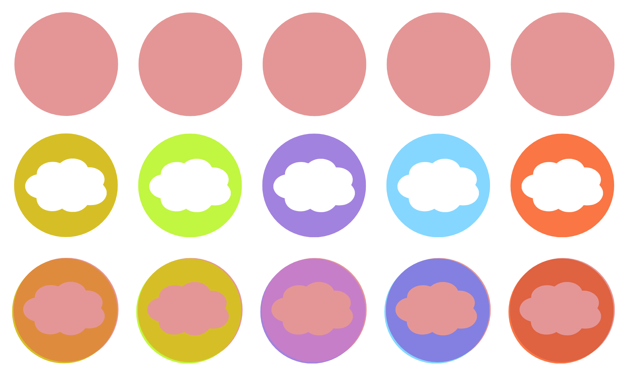
Say you’ve got orange on your page from the last layer you printed, and for your next layer, you want brown. Do you mix brown ink? No. You mix purple ink, then roll it on your block thinly, and purple layered on top of orange results in brown. Depending on what kind of press/hand-printing you’re using, you’ll have more or less control of this, so do your own experiments. You may need to add transparent base to your ink, but in my experience, most relief inks are inherently transparent.
This applies to any medium that involves using colour washes.
(does this make sense?)
But why?
Because most relief inks are inherently transparent, if you’re trying to print yellow on top of pink, you will fail and get orange every time. But if you print lime green on top of pink it WILL look yellow.
You use less ink, which results in cleaner, less edge-squishy prints. Your ink dries faster, so you don’t have to wait so long between layers.
Your print gets this je-ne-sais-quoi dynamic colour quality, where the two colours vibrate off each other if you look closely or if your paper has more texture. Or if your layers are slightly mis-registered, you get this glowing line of colour that’s deeply interesting.
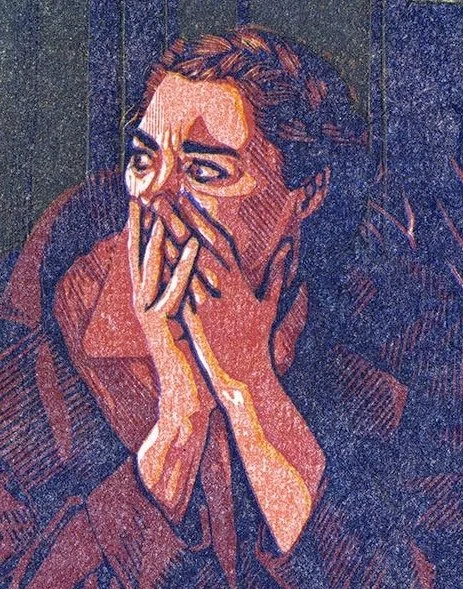
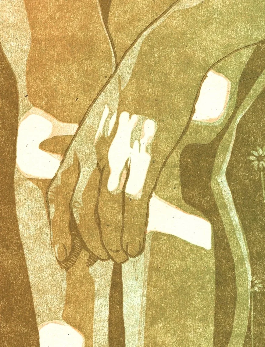
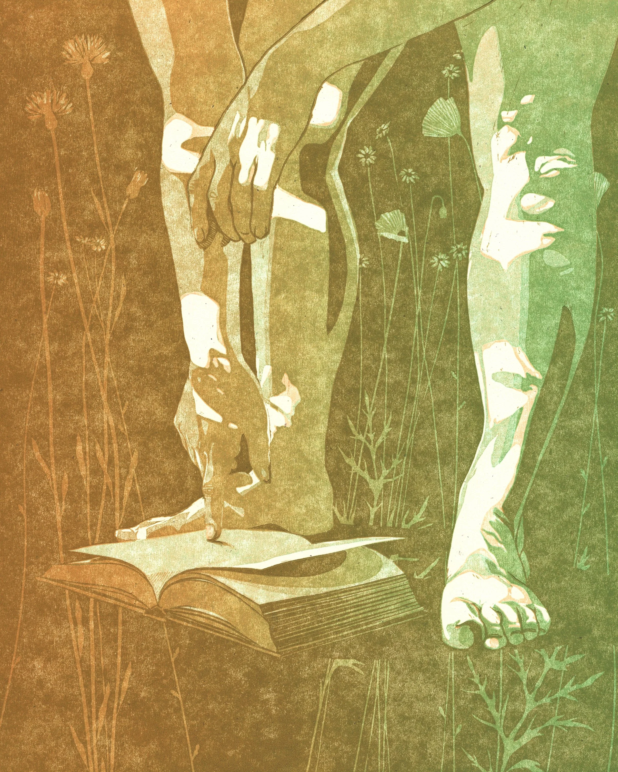
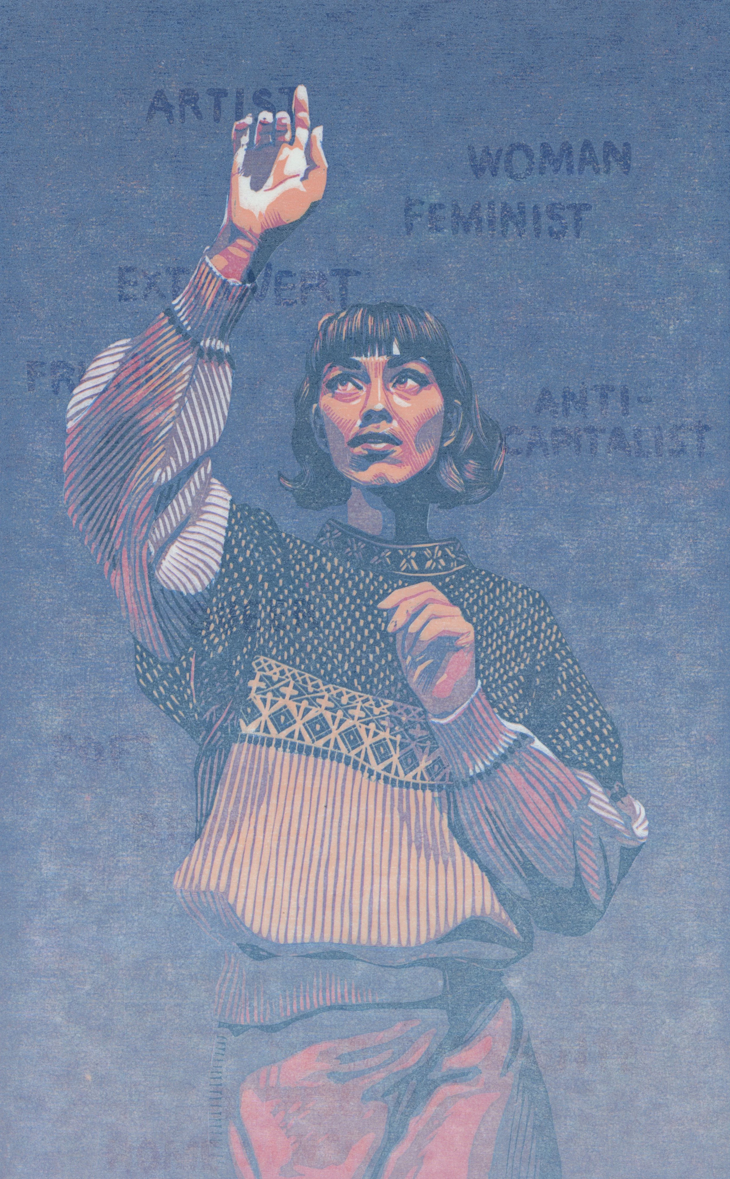
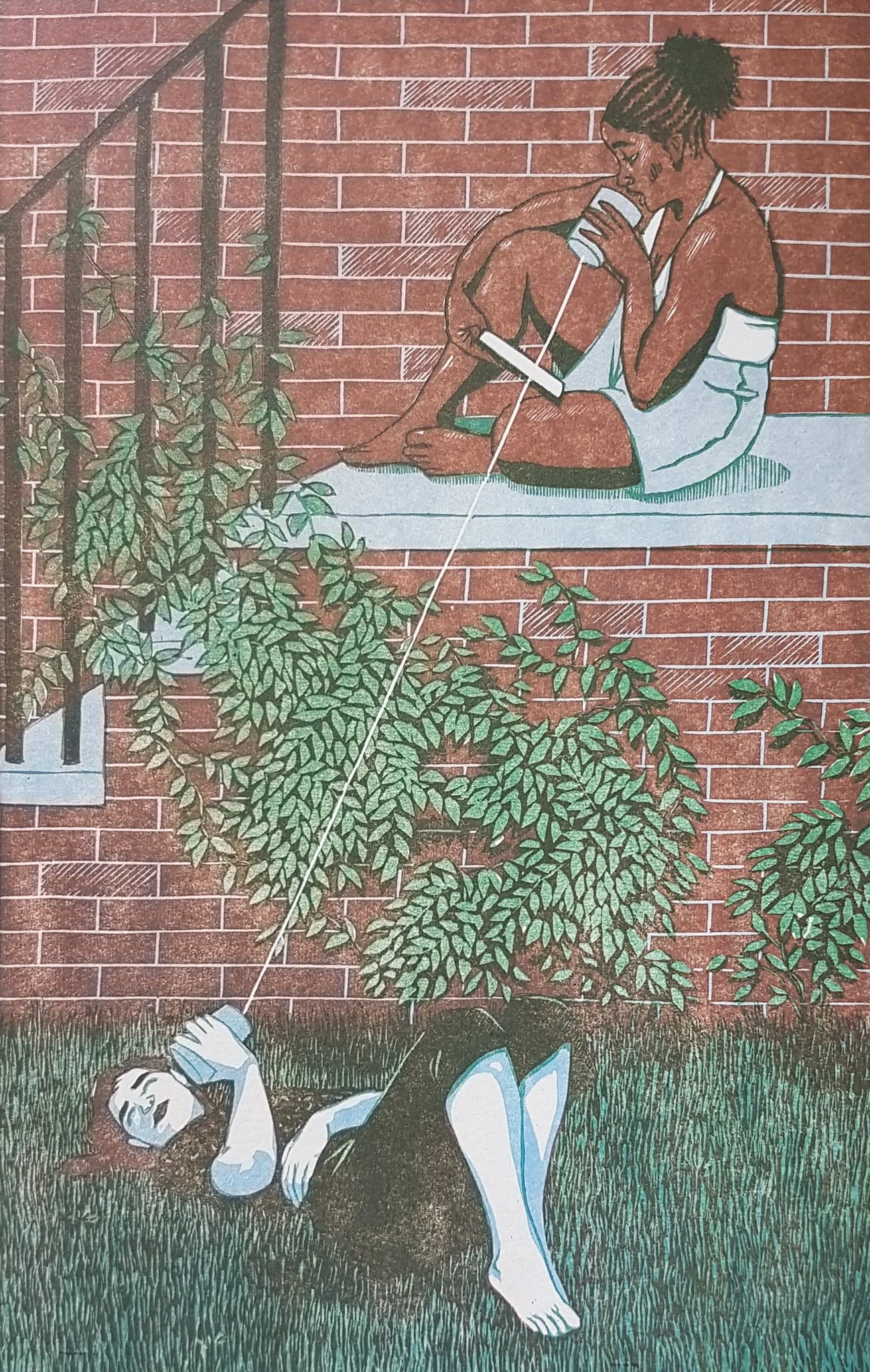
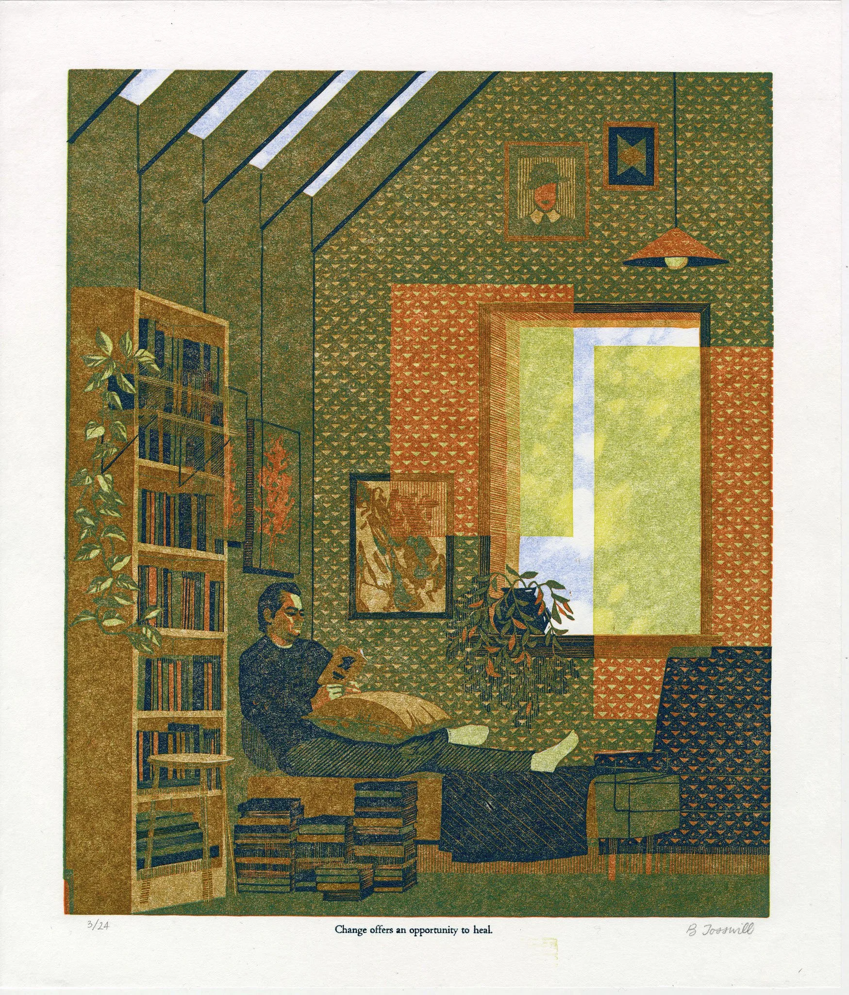
Hot Edges
This is an entirely different concept from the glowing line mentioned above. I’m pretty sure I got the phrase "hot edges" from someone on the internet, and it is a strategy for rendering skin. I’ve talked about my approach to skin tones before (portraiture in linocut), but this is an advanced strategy.
Basically, the line between your lights and your midtones will have a warmer, more saturated look as compared to the colours on either side of it. This really helps capture the luminous quality of skin (all colours), especially if you’re using non-local colour to depict it (see the greenish image below).
How much Contrast?
This one, I think about and learn about EVERY SINGLE TIME I make a new artwork. The tricky thing about reduction linocut is that your perception of the colours you have already printed will change after you print another colour on top of them. Always. (this will become its own whole post at some point) If you enjoy delicate colour-interplay, then your estimations will be thrown off again and again.
When I print my first colour, I have learned to print it darker and slightly less saturated than I think I want. It’s nearly always the lightest colour of the print, but it looks stark when it’s the only thing on the page. As soon as any colour depth is introduced via darker colours, it will change to appear more like the colour of the paper.
This effect is most pronounced in the earliest layers and is still present in darker layers. My most successful strategy to counteract this is to plan out my colours as swatches and compare each layer to the planned colour palette as I go. There’s room for improvisation, but more towards the end of the process than the beginning, when more of your image is already in place.
How many colours?
I tend to max out my prints at 7 layers. 5 is often enough. I’ve learned to create in-between colours with hatching, thereby reducing the need for as many layers. I might be swinging pendulum-like towards simpler carving and more layers as I try to make the linocut process discernible in my work.
When you stand back from your work (like, a meter) and some of your layer distinctions become invisible, you know that your print has too many colours. Try to avoid invisible labour.
Try to hit both sides of the colour wheel in some capacity.
Lights
My lightest colour is almost always peach or pale blue. This has a lot to do with my preference to depict people (the peach) and sky (the blue).
first layer peach:
first layer pale blue:
bonus: first layer selectively inked peach AND pale blue:

Shadows
For a long time, I’ve had a hard rule that I never use black in my linocut reductions. My palettes are usually so soft and subtle that black completely flattens them. Instead, I use navy, dark green, burgundy, or brown as my darkest tone. This might also have been a reaction to the black-as-default aesthetic in the linocut and broader printmaking world. I’m no longer rejecting it out of hand, but it would require a specific kind of print for me to use it.
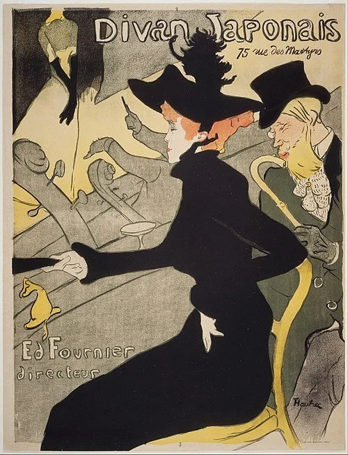
Often, the darkest colour in a print is the “key layer” (not always. Toulouse-Lautrec consistently used dark green as a key layer and black as a fill colour in his lithographs). I try to steer clear of outlines in my final layer, because they flatten your delicate colour interplay and can look cartoonish. If you’re using outlines, try carving them away as soon as they are one layer darker than the colour they surround. More on this in How to make sense of Reduction Linocut.
Midtones
I read somewhere that the colour of an object is usually most saturated in the midtone. Think of a red sphere. The light hitting the sphere is desaturated compared to the red (red mixed with white). And the shadow is desaturated as well (red mixed with black). As a general rule, a print looks better if its midtones are more saturated than either the lights or shadows.
Unbelievably, I cannot find a free-use image of a red sphere to illustrate this, but look at any solid coloured (and matte) object in your environment for a good illustration.
Palette
Colour is mood. The first thing to consider when choosing which colours to include in your art is how you would like the image to feel. Does that feeling go better with a warm or cool palette? Is it better communicated via saturated colour, or more muted tones? Will the overall image be high key, or low key, or kept in the realm of middle gray? Is it more effective to use your primary emotional colour as a wash across the whole image, or as a pop, a contrast?
Try not to be too attached to local colour. One of the best ways to make an image interesting is by changing the colour of something recognizable.
Instead of trying to decide which colours to use, try deciding which colours not to use. See my avoidance of black, above. I try to let every print tell me what it needs, and different bodies of my work have their own parameters, but I rarely use the primary, fully-saturated version of any colour, or any colour you could find in a 12 pack of coloured pencils. That is to say, those colours never show up in my finished work, but as stated near the top of this page, I use them all the time as transparent ink layers over other colours.
